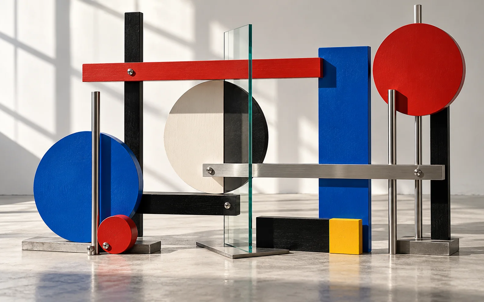
A school before it was a style
Founded in 1919, the Bauhaus was a school before it became a visual shorthand. Its workshops tested how material, production, typography, architecture, and daily life could be designed as one connected system.
The familiar circles, grids, and primary colors are only the surface. The deeper idea is that form should emerge from purpose, material behavior, and a willingness to prototype.
Visual anatomy
Clear geometry organizes attention. Asymmetry often creates movement without sacrificing order.
Restricted palettes clarify relationships. Primary colors are common, but contrast and function matter more than a fixed recipe.
Sans-serif type, strong scale shifts, and active alignment turn information into spatial composition.
Wood, metal, glass, textile, and light are treated according to their own physical qualities.
Empty space is structural. It separates functions, establishes hierarchy, and lets geometry breathe.
Workshop testing connects idea and making. The process favors prototypes, systems, and reproducibility.
How to recognize it
- Geometry serves an organizational purpose.
- Type, image, object, and space feel like parts of one system.
- Decoration is reduced, but material character remains visible.
Where people get it wrong
Bauhaus is not simply primary colors plus circles. De Stijl tends toward a more rigid vocabulary of orthogonal form and color. International Style architecture shares functional concerns, but Bauhaus also includes workshops, performance, photography, textiles, and education.
The words to describe it
Precise words for the qualities above. Combine a few of them instead of naming the style or artist alone.
- asymmetric grid
- primary colors with black and white
- geometric sans-serif
- circle, square, triangle
- photomontage
- diagonal typography
- tubular steel
- flat color planes
- functional layout
- generous negative space
A poster on an asymmetric grid: a red circle, a heavy black bar and a block of lowercase geometric sans-serif set on a diagonal. Flat colors on off-white paper, wide empty margins.
What to take from it today
- Let a real use case determine the grid before styling it.
- Choose materials for behavior, not nostalgia.
- Build a small set of reusable rules, then allow asymmetry inside the system.
Redesign one everyday object using only three materials. For every line, color, and joint, write one sentence explaining what it does. Remove anything with no answer.