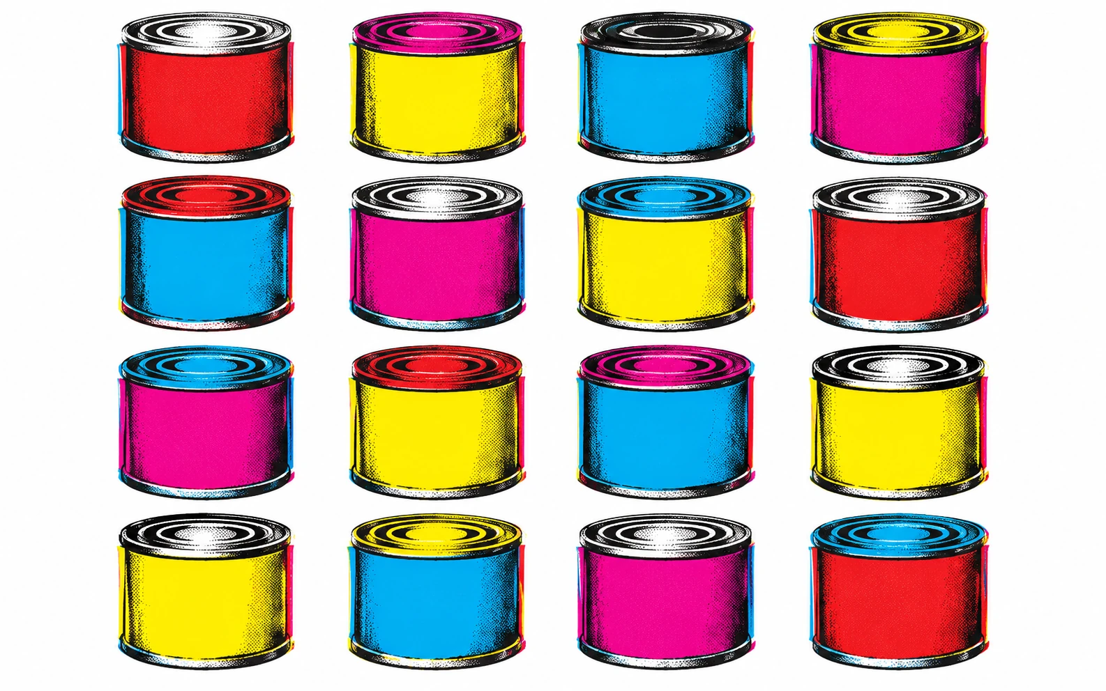
The supermarket enters the gallery
Pop Art began in Britain in the mid-1950s, with artists around the Independent Group such as Richard Hamilton and Eduardo Paolozzi collaging magazine images of consumer life. In the early 1960s it exploded in the United States with Andy Warhol, Roy Lichtenstein, Claes Oldenburg and James Rosenquist.
Instead of the heroic, personal brushstroke of Abstract Expressionism, Pop used the anonymous look of mass production: silkscreen, Ben-Day dots, logos, repetition. Whether it celebrated consumer culture or quietly criticized it is still argued about, and that ambiguity is part of its power.
Visual anatomy
Brands, packaging, comic panels, film stars, food, cars: images everyone already knows.
Flat, saturated primaries and fluorescent tones, often straight from commercial printing.
Bold black outlines borrowed from comics and sign painting.
Ben-Day dots, halftone, misregistered silkscreen layers: the look of cheap printing made monumental.
The same image repeated in grids, like products on a shelf.
Small everyday things blown up to huge size, or sculptures of food and objects.
How to recognize it
- The image feels borrowed from ads, comics or packaging.
- Flat color with strong outlines or visible print dots.
- Repetition and seriality instead of a single precious image.
Where people get it wrong
Pop Art is not just 'bright and fun'. Much of it is cool, detached and even unsettling: car crashes, electric chairs, the emptiness of celebrity. And comic dots alone do not make an image Pop; the idea of borrowing mass-culture imagery does.
The words to describe it
Precise words for the qualities above. Combine a few of them instead of naming the style or artist alone.
- Ben-Day dots
- halftone pattern
- silkscreen print
- misregistered colors
- flat saturated color
- bold comic outline
- repeated grid
- consumer products
- celebrity portrait
- oversized everyday object
A grid of nine identical soup-can-like packages, each printed in a different flat bright color scheme, slight misregistration between the color layers, visible halftone dots, a clean white background.
What to take from it today
- Look at the images around you that no one calls art.
- Use printing's 'flaws' as a deliberate texture.
- Repeat an image until it changes meaning.
Photograph one ordinary product from your kitchen. Make a grid of nine versions, changing only the color each time. Notice when it stops being a product and becomes a pattern.